Do you sometimes have the feeling that you are losing out on valuable website sales?
Do you keep track of your website visitors daily and yet don’t seem to convert them into actual customers?
Do you believe that your website looks too good not to capture a visitor’s attention immediately?
These questions pop up all the time and there is no need to wonder anymore. It doesn’t matter how successful you are, there is always more work to be done. We’ve gathered twelve of the most fundamental design principles for increasing conversions, as well as some of the mistakes you can make when it comes to designing your landing page.
With web pages you often have less than 20 seconds to grab someone’s attention. Some people say 8 seconds. There is a simple test you can do – get someone who has never looked at your website (and preferably doesn’t know about your business) to look at your homepage for 20 seconds, then ask them what do they remember. You will be fascinated with the results and it will tell you a lot about what is working and what is not.
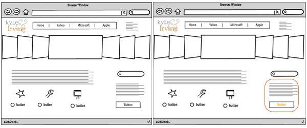
Placement is key: First up a simple one, your contact information. If you want more people to contact you, you need to make it easy for them to find your contact info. We read from left to right (left to right languages) and top to bottom, so put your logo on the left side and the contact info on the right. You should also consider the placement of your conversion elements and now is the time to mention that exploring your website should not be like trying to find hidden treasure. Instead use persuasive design for lead generation. If you have a form on your website, don’t bury it, make it stand out. Use encapsulation (a container/border) to highlight what’s inside. You might even like to use directional elements to guide the eye. This way you are drawing attention to the form and the call to action (CTA). Easy enough.

Navigation necessities: Just use the K.I.S.S. method. This way your visitors won’t flee with the speed of light once they come across your website for the first time. Have the navigation menu at the top of the website and perhaps a simpler version at the bottom. Use colour and contrast to make it more visible.
The 3-click rule: You know what they say – if something takes more than 3 clicks to be found, you need to simplify it. Let’s face it – people are busy! They are impatient and they don’t have unlimited time to browse your website. And if they can’t find the information they need within these three clicks, then…
Let them search : Your page may look user-friendly to you, but that’s because you’ve been looking at it for too long. Put a search box at the top of the home page to let visitors use key terms to find exactly what they are looking for.
Content is King…or is it: Again, visitors are busy and might not have the time to actually read all the information, but make sure their quick scan is worth their time. Relevant images, clear links, bullet points, great font, clear division of the content, proper subheadings. Use bigger font size for your key messages (sound bite) and smaller font to explain the sound bite. Make sure you answer:
- What is it?
- What’s in it for me? (not you, your customer what’s in it for them)
- How does it work?
- Where do i begin? (again not you ! 🙂 )
Colour and contrast on your landing page: Use between 2 and 4 colours that are associated with your brand and tie the image with the colour scheme. For example, if your logo is blue, the hyperlink colour should also be blue so it stands out. Use colour creatively to direct the focus of the visitors to what you want them to see. Colour can also provoke emotional response. One such colour is orange – generating positive feelings. Use it as the colour for your CTA. Green is generally associated as the colour for Go and blue is perfect for link colour. If you want your visitors to see a particular part of the page before anything else, you need to use the “in your face” approach – a good contrast to the predominant colour. For example, if the predominant colour is green, then a bright red button will literally jump off the page. CTA spotted. Mission accomplished.
(these buttons go nowhere!)
Stay tuned for Part II. Use the comment box if you have any tips you would like to share or to tell us about the ways you use web design to increase conversion.

